Meme wale Kapre
Branding
Re-designed their entire brand identity including Logo, Fonts, Color pallet and Vibe to better match the Gen Z audience.
Year :
Industry :
Client :
Project Duration:
2025
Clothing
Meme Wale kapre
2 months
Year :
Industry :
Client :
Project Duration:
2025
Clothing
Meme Wale kapre
2 months
Company's Introduction:
Meme Wale Kapre is a Gen Z memes orientated streetwear clothing brand offering a wide variety of clothing such as T-shirts and hoodies which consist of designs that are aligned with latest meme culture and trending songs. The brand focuses on shirts that are a good conversation starter.
Problem 1:
Meme Wale Kapre began as a simple Instagram page, a fun side project with no real plans. But it grew much faster than the owner expected, and the old visuals he created himself could not keep up. The branding had no clear direction and didn’t match the taste of the Gen Z audience that was now following the page. That’s when he approached me for a full rebrand that truly reflected the brand’s new identity and growth.
Solution:
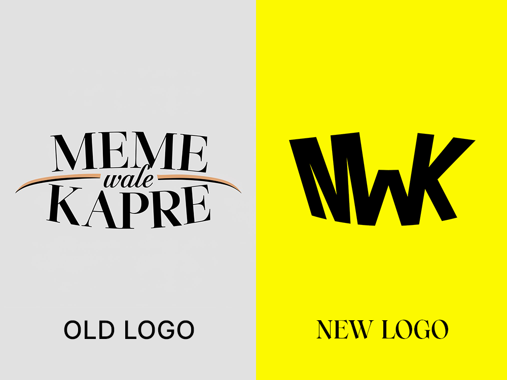
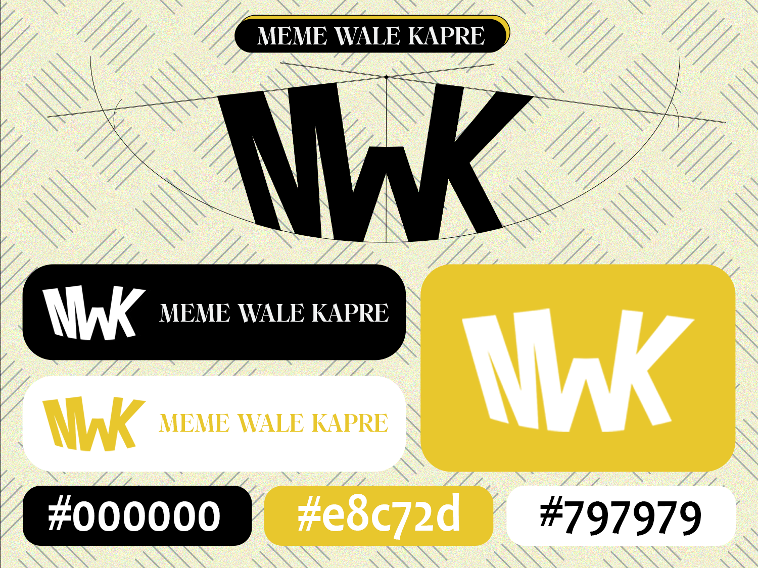
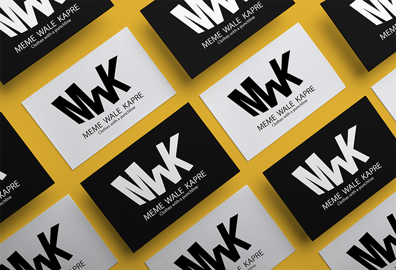
To make the brand attract Gen Z audience, I started with the logo. The old logo was generated by Ai and was lacking a soul. Client wanted a minimal design which was a good nice specially for Gen Z audience. Made multiple concepts and client settled with this design which is very easy to remember and has a serious not serious vibe to it, which him and his audience loved after a story poll.
Problem 2:
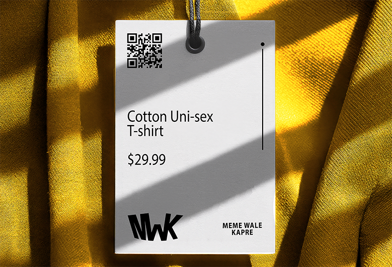
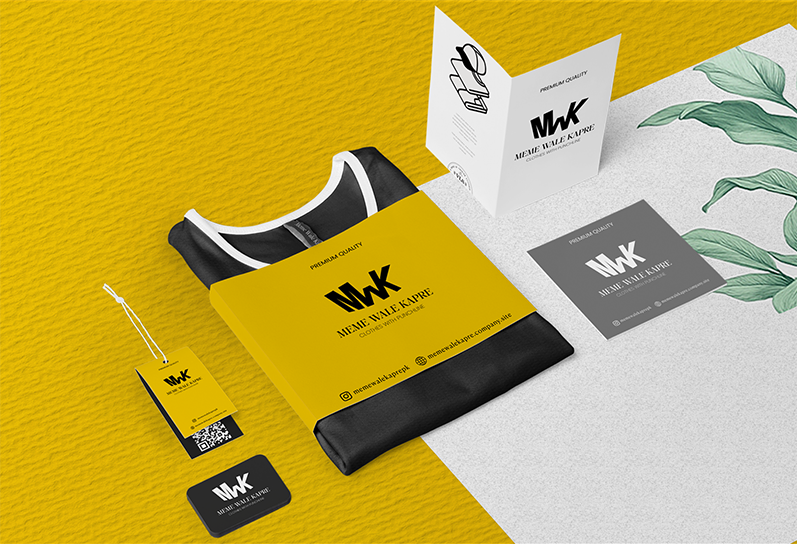
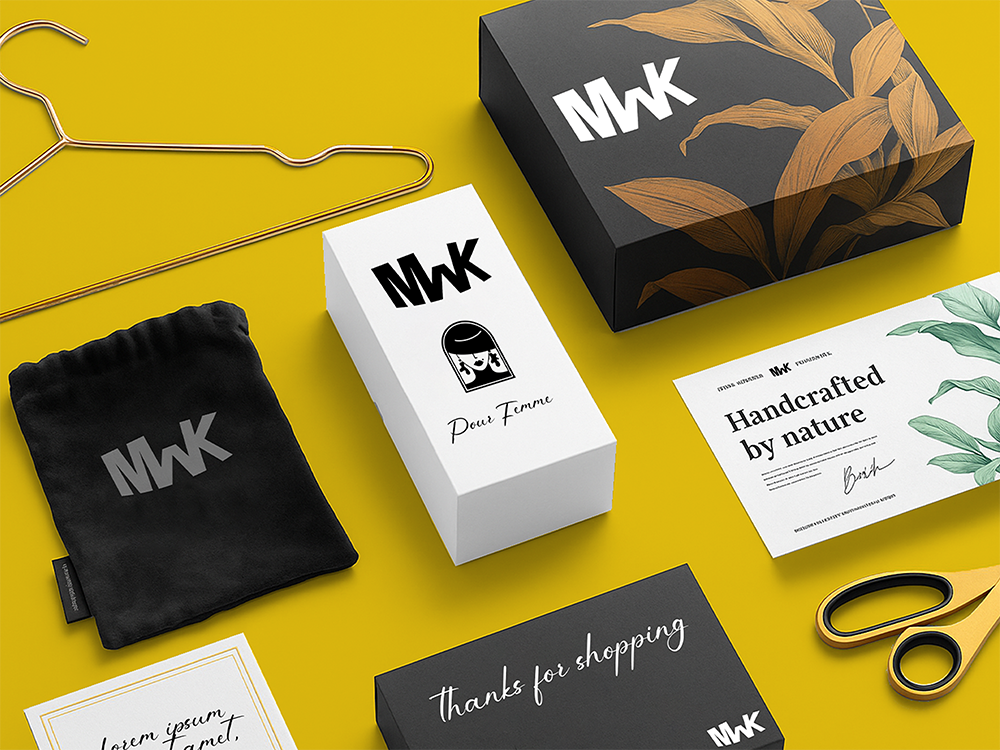
As the brand grew, the brand required custom packing such as boxes, tags, thank you cards and mystery box for one of their campaigns. They also required packaging design for their new products such as perfumes. Due to vast choice of products brand offers, the sizes and format varied substantially across the whole product lineup.
Solution:
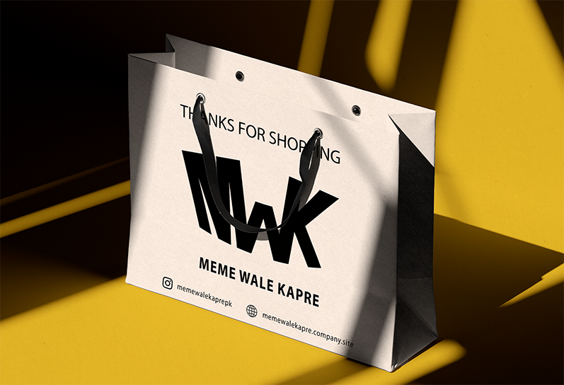
So I carefully designed each item so that the aesthetics remain consistent throughout the page and it's packaging. The sizes and formats were specifically designed for each clothing or other item. The purpose of these design was to leave an impression to the views eye that the next time they look at the packaging somewhere, they instantly recognize it.
